
Metal buildings have come a long way from purely utilitarian structures. Today’s metal buildings, whether agricultural, commercial, or residential, are design statements. A two-tone metal building color scheme is one of the smartest ways to elevate curb appeal, define architectural lines, and make a structure blend seamlessly with your property’s landscape. Unlike single-color finishes, two-tone schemes create visual interest, break up large wall planes, and can even improve perceived proportions. This guide walks through why two-tone works, classic pairings that endure, contemporary combos trending in 2026, and how to pick the right combo for your project.
Table of Contents
ToggleKey Takeaways
- Two-tone metal building color schemes break visual monotony across large wall surfaces and create a refined, intentional aesthetic that improves curb appeal and perceived proportions.
- Classic pairings like white with charcoal gray deliver timeless appeal, while contemporary combos such as slate gray with warm tan or navy with cream reflect 2026 design trends with personality.
- Practical benefits of two-tone designs include lighter roofs that reduce cooling costs through heat reflection and darker lower walls that hide dirt and weathering better than single-color finishes.
- Always test paint samples on-site for at least one week under various light conditions (morning, noon, dusk) before committing, as colors shift dramatically and indoor chip viewing can mislead decisions.
- Choose your color combination based on landscape context, building function, local regulations, and long-term maintenance expectations to ensure your two-tone scheme remains an asset for years.
Why Two-Tone Color Schemes Work for Metal Buildings
Two-tone schemes succeed for metal buildings because they break visual monotony across large, flat wall surfaces. A 40-foot-wide wall painted one color reads as a solid block: the same wall split horizontally or vertically with a contrasting tone feels more refined and intentional. Psychologically, humans respond to variation, it signals thoughtfulness, not accident.
Metallic finishes amplify this effect. A crisp white upper wall paired with charcoal lower panels creates a clean, grounded appearance that works on industrial sheds and modern residential structures alike. The contrast also highlights the building’s proportions and can visually lower a tall structure or anchor a compact one.
Practically, two-tone work cuts maintenance risk. Lighter roofs reflect heat, reducing cooling costs: darker lower walls hide dirt and weathering better than all-white designs. Split the visual load, and you get function plus form. Many homeowners find that choosing two colors forces them to plan the facade thoughtfully rather than defaulting to a single shade, and that deliberation almost always improves the final result.
Classic Combinations That Never Go Out of Style
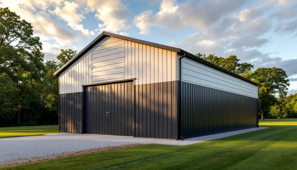
White and Charcoal Gray
White walls with charcoal gray lower panels or roof create a timeless, crisp aesthetic that pairs with farmland, suburbs, and modern home lots equally well. White reflects sunlight (a real asset in hot climates), while charcoal lower sections anchor the structure and hide soil splatter and dust.
This combo works because it’s familiar, think barns, industrial warehouses, and contemporary homes. You’re not fighting expectations: you’re meeting them. The contrast is strong enough to define the building without jarring the eye. Consider variation: pure white (RGB 255, 255, 255) can feel sterile: instead, many builders specify off-white or light gray (like a RAL 9016 or RAL 7035) paired with darker charcoal (RAL 7016 or RAL 7024). The slight warmth in off-white feels friendlier than pure white, and matte finishes look more premium than glossy ones.
Black and Silver
Black and silver reads modern and bold. A black lower wall or frame with silver-gray panels above (or vice versa) conveys contemporary confidence. This scheme is less forgiving in bright sunlight, black absorbs heat and can expand/contract slightly, but in cooler climates or when you’re OK with slightly higher cooling costs, it’s striking.
The strength of black-and-silver is its drama. It signals that the owner isn’t afraid of dark colors and isn’t chasing a “safe” aesthetic. Pair it with concrete, gravel, or modern landscaping, and the building looks intentional and curated. But, maintenance matters: black panels show dust, pollen, and water spots more visibly than lighter colors, so plan for more frequent cleaning if appearance is critical.
Contemporary Two-Tone Schemes for Modern Aesthetics
Beyond classics, 2026 trends favor unexpected pairings that still feel balanced. Slate gray with warm tan creates a sophisticated, earthy contrast, especially popular for homes in rocky or desert settings. Deep navy or forest green paired with cream white evokes cabin aesthetics and works beautifully in wooded properties. These combos are modern because they move past pure gray-and-white into colors with personality.
Brick red with light sand achieves farmhouse warmth without looking dated. Charcoal with light blue (yes, really) creates a cool, Scandinavian vibe, unusual but increasingly popular in regions leaning minimalist. These aren’t trends you’ll abandon in five years: they’re colors supported by real architectural styles.
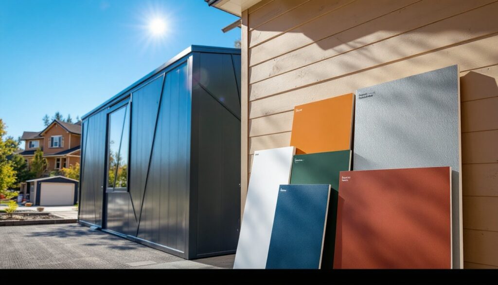
When selecting contemporary schemes, think about surroundings first. A two-tone building against dense trees reads differently than one on open plains. Test samples under different light conditions, morning, noon, and overcast, before committing. Colors shift. What looks perfect on a chip in afternoon sunlight can feel too dark or washed out at dawn. If your budget allows, paint small test panels on the actual building or an adjacent piece of metal and live with them for a few days. Design professionals featured on Curbed consistently stress this step, and for good reason.
Another contemporary angle: texture variation. Matte finishes paired with semi-gloss in the same color family creates subtle visual interest without a second hue. It’s sophisticated and practical, gloss hides weather better, matte hides minor imperfections. Split the difference.
How to Choose the Right Color Combination for Your Property
Start with context. What’s your landscape like? Lush green surroundings favor cool, sophisticated tones (blues, grays). Arid or sandy terrain suits warm combos (tans, soft reds, warm grays). Urban properties with modern architecture benefit from bold contrasts (black-silver, navy-cream): rural or traditional settings often read better with softer splits.
Second, consider the building’s function. An agricultural metal building can carry bolder colors than a residential guest house. A commercial storage building might benefit from high-contrast safety (lighter tops for visibility, darker bottoms for durability). A home workshop or garage should harmonize with the main house, not compete with it.
Third, check local building guidelines and HOA rules if they apply. Some areas restrict exterior color choices or require building permits for significant cosmetic changes. Verify before purchasing materials. Technical guidance on building performance includes color selection strategies tied to climate zones, darker colors in cold regions capture passive solar heat, while lighter palettes in hot zones minimize heat gain.
Fourth, think long-term maintenance. Lighter colors show dirt faster but hide fading. Darker colors hide dirt but require heat-resistant coatings and show water spots. Mid-tone combos often strike the best balance. If you’re in a dusty or coastal area, maintenance costs might favor lighter colors overall even though more visible stains.
Finally, sample real products. Paint chips lie under indoor lighting. Order sample panels from your metal supplier, mount them on the actual structure, and observe them for at least a week. Morning light, afternoon sun, and dusk all change perception. Homeowners planning steel building exteriors often regret rushing this step. Take the time. A few hundred dollars spent on samples beats repainting a whole building.
Conclusion
A well-chosen two-tone metal building color scheme transforms a utilitarian structure into an asset. Whether you go classic (white and charcoal) or contemporary (slate and tan), the strategy is the same: contrast that defines architecture, function that meets form, and colors tested in real light before commitment. Plan thoughtfully, sample on-site, and you’ll enjoy your decision for years.